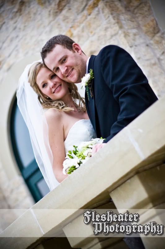
But if I'm going to be professional and make money from my work, I see it as something I may need to do once and a while.
So i figured I would try it out and see if I could get some feedback.
Let me know what you think please!

(btw this shot is a sneak peek to the wedding I shot at last week,
I just quickly edited it for use here, blog still to come!)


6 comments:
I like it but it's a little big for my taste.
I think the smaller the better so as not to take away from the picture, ya know?
Yeah, I think so too... but it needs to be legible... idk.. id almost rather not use one... I may just change my flickr settings so people cant see my photos larger enough to print clearly...
hmmm... decisions decisions.
I think it's perfect.
i would totally agree with you about having to mark my work. i did it for a while, but then decided i hated it. as far as your logo goes, i would agree with you and vanessa, i personally think it may be a bit large.
maybe an idea would be to just come up with a logo of sorts...not just your name, but a simple graphic. don't make it too flashy, but still enough to show people who you are. if i come up with any ideas i'll shoot them your way.
the photo is rad though.
HAHAHAAHA. "Flesheater Photography over a wedding photo is absolutely fantastic.
I really go back and forth about this because i now use the creative common copyright when I publish any works. I ealize that its a professional thing, but I don't know. Isn't it flattering to have someone random use your work? Are there really a bunch of people stealing photography (or writing for that matter) and passing it off as their own? And if there are, doesn't the truth win out in any case? Just my opinion! I think you'r logo is tasteful and not too big (but I like christanlanephotography's, too and it's kind of big).
Post a Comment